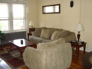
Today I'm featuring our Living Room Redesign. As you know by now, we did alot of updates/renovations to our home after I moved in. Below you can check out the BEFORE and AFTER pics of our living room area. Now the BEFORE living room wasn't bad at all...it actually looks good especially for a guy. But since I was moving in, I wanted to warm it up a bit more.
Lets reveiw a few things I noticed right away that needed an update:
1. Curtains - There were no curtains anywhere!
2. Wall color - The color isnt bad at all and depending on the look you are going for, it could work. I just wanted something that popped a little more.
3. Mirror -- Im a huge fan of mirrors in living areas but this one doesnt quite work for the space. Again, it doesn't look bad but it isn't the best fit for the wall space.
4. Lamps -- the two lamps on each side of couch create symmetry in the room, however, the style of the lamps are a little dated.
5. Masks hanging on wall -- it looks a bit out of place and his 'friend' is all the way on the other wall by the door.
BEFORE pics
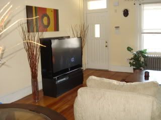
6. Pub table -- I love pub tables but they dont have a formal dining feel because they really aren't for that. However, they do go really well in bachelor's pads which we NO LONGER HAVE! lol
7. Dated light fixture over pub table - the pic cuts it off so you cant see it but there was a dated gold light fixture over table
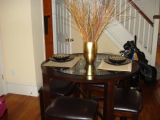
First thing we had to do was decide what colors we wanted to go for on the walls. I've always been a fan of the blue & brown look so we decided to go with that. Plus I think browns and other nuetrals in that color family really warm up a place.
AFTER pics
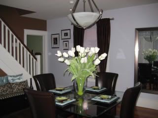
So for the dining area, we switched out the lighting fixture, added curtains, added a long mirror on wall, and got a new table set along with a centerpiece (from Home Goods). Check out the bench by the stairs. Remember I posted how I recovered it. In case you missed it, check it out here
We also did an accent wall in a chocolate brown color.
Here is one more pic of updated living area:
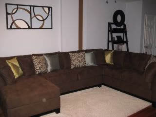
Now you see how the painting I did looks in the room. In case you missed that posting, check it out here. I also made a few pillows - see below
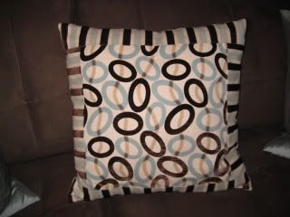
and bought the others. And the great thing about pillows is that you can switch them up anytime to give your room a new look!
Lastly, I got a shag rug in cream. Originally I wanted to add a coffee table in the middle area of sectional but I never found anything I was in love with. So we kept it clear which seems to work better anyway now.
Overall, I think our living room redesign came out well. Its cozy and we enjoy relaxing in the room and thats what really matters! :)
P.S. We used Valspar Paint from Lowes
Lets reveiw a few things I noticed right away that needed an update:
1. Curtains - There were no curtains anywhere!
2. Wall color - The color isnt bad at all and depending on the look you are going for, it could work. I just wanted something that popped a little more.
3. Mirror -- Im a huge fan of mirrors in living areas but this one doesnt quite work for the space. Again, it doesn't look bad but it isn't the best fit for the wall space.
4. Lamps -- the two lamps on each side of couch create symmetry in the room, however, the style of the lamps are a little dated.
5. Masks hanging on wall -- it looks a bit out of place and his 'friend' is all the way on the other wall by the door.
BEFORE pics


6. Pub table -- I love pub tables but they dont have a formal dining feel because they really aren't for that. However, they do go really well in bachelor's pads which we NO LONGER HAVE! lol
7. Dated light fixture over pub table - the pic cuts it off so you cant see it but there was a dated gold light fixture over table

First thing we had to do was decide what colors we wanted to go for on the walls. I've always been a fan of the blue & brown look so we decided to go with that. Plus I think browns and other nuetrals in that color family really warm up a place.
AFTER pics

So for the dining area, we switched out the lighting fixture, added curtains, added a long mirror on wall, and got a new table set along with a centerpiece (from Home Goods). Check out the bench by the stairs. Remember I posted how I recovered it. In case you missed it, check it out here
We also did an accent wall in a chocolate brown color.
Here is one more pic of updated living area:

Now you see how the painting I did looks in the room. In case you missed that posting, check it out here. I also made a few pillows - see below

and bought the others. And the great thing about pillows is that you can switch them up anytime to give your room a new look!
Lastly, I got a shag rug in cream. Originally I wanted to add a coffee table in the middle area of sectional but I never found anything I was in love with. So we kept it clear which seems to work better anyway now.
Overall, I think our living room redesign came out well. Its cozy and we enjoy relaxing in the room and thats what really matters! :)
P.S. We used Valspar Paint from Lowes




Incredible!!! I am so inspired.
ReplyDeleteThanks Terri!
ReplyDeleteOutstanding! It looks like you stepped into a completely different house!
ReplyDeleteThanks girl!
ReplyDeleteThis comment has been removed by a blog administrator.
ReplyDelete